Below, we re-post Sean’s blog which outlines how the story unfolded, and the analysis that he ran.
*****************************************************************************************************************************************
“CCR5-∆32 is deleterious in the homozygous state in humans” – is it?
I debated for quite a long time on whether to write this post. I had said pretty much everything I’d wanted to say on Twitter, but I’ve done some more analysis and writing a post might be clearer than another Twitter thread.
To recap, a couple of weeks ago a paper by Xinzhu (April) Wei & Rasmus Nielsen of the University of California was published, claiming that a deletion in the CCR5 gene increased mortality (in white people of British ancestry in UK Biobank). I had some issues with the paper, which I posted here. My tweets got more attention than anything I’d posted before. I’m pretty sure they got more attention than my published papers and conference presentations combined. ¯\_(ツ)_/¯
The CCR5 gene is topical because, as the paper states in the introduction:
In late 2018, a scientist from the Southern University of Science and Technology in Shenzhen, Jiankui He, announced the birth of two babies whose genomes were edited using CRISPR
To be clear, gene-editing human babies is awful. Selecting zygotes that don’t have a known, life-limiting genetic abnormality may be reasonable in some cases, but directly manipulating the genetic code is something else entirely. My arguments against the paper did not stem from any desire to protect the actions of Jiankui He, but to a) highlight a peer review process that was actually pretty awful, b) encourage better use of UK Biobank genetic data, and c) refute an analysis that seemed likely biased.
This paper has received an incredible amount of attention. If it is flawed, then poor science is being heavily promoted. Apart from the obvious problems with promoting something that is potentially biased, others may try to do their own studies using this as a guideline, which I think would be a mistake.
I’ll quickly recap the initial problems I had with the paper (excluding the things that were easily solved by reading the online supplement), then go into what I did to try to replicate the paper’s results. I ran some additional analyses that I didn’t post on Twitter, so I’ll include those results too.
Full disclosure: in addition to tweeting to me, Rasmus and I exchanged several emails, and they ran some additional analyses. I’ll try not to talk about any of these analyses as it wasn’t my work, but, if necessary, I may mention pertinent bits of information.
I should also mention that I’m not a geneticist. I’m an epidemiologist/statistician/evidence synthesis researcher who for the past year has been working with UK Biobank genetic data in a unit that is very, very keen on genetic epidemiology. So while I’m confident I can critique the methods for the main analyses with some level of expertise, and have spent an inordinate amount of time looking at this paper in particular, there are some things where I’ll say I just don’t know what the answer is.
I don’t think I’ll write a formal response to the authors in a journal – if anyone is going to, I’ll happily share whatever information you want from my analyses, but it’s not something I’m keen to do myself.
All my code for this is here.
The Issues
Not accounting for relatedness
Not accounting for relatedness (i.e. related people in a sample) is a problem. It can bias genetic analyses through population stratification or familial structure, and can be easily dealt with by removing related individuals in a sample (or fancy analysis techniques, e.g. Bolt-LMM). The paper ignored this and used everyone.
Quality control
Quality control (QC) is also an issue. When the IEU at the University of Bristol was QCing the UK Biobank genetic data, they looked for sex mismatches, sex chromosome aneuploidy (having sex chromosomes different to XX or XY), and participants with outliers in heterozygosity and missing rates (yeah, ok, I don’t have a good grasp on what this means, but I see it as poor data quality for particular individuals). The paper ignored these too.
Ancestry definition
The paper states it looks at people of “British ancestry”. Judging by the number in participants in the paper and the reference they used, the authors meant “white British ancestry”. I feel this should have been picked up on in peer review, since the terms are different. The Bycroft article referenced uses “white British ancestry”, so it would have certainly been clearer sticking to that.
Covariable choice
The main analysis should have also been adjusted for all principal components (PCs) and centre (where participants went to register with UK Biobank). This helps to control for population stratification, and we know that UK Biobank has problems with population stratification. I thought choosing variables to include as covariables based on statistical significance was discouraged, but apparently I was wrong. Still, I see no plausible reason to do so in this case – principal components represent population stratification, population stratification is a confounder of the association between SNPs and any outcome, so adjust for them. There are enough people in this analysis to take the hit.
The analysis
I don’t know why the main analysis was a ratio of the crude mortality rates at 76 years of age (rather than a Cox regression), and I don’t know why there are no confidence intervals (CIs) on the estimate. The CI exists, it’s in the online supplement. Peer review should have had problems with this. It is unconscionable that any journal, let alone a top-tier journal, would publish a paper when the main result doesn’t have any measure of the variability of the estimate. A P value isn’t good enough when it’s a non-symmetrical error term, since you can’t estimate the standard error.
So why is the CI buried in an additional file when it would have been so easy to put it into the main text? The CI is from bootstrapping, whereas the P value is from a log-rank test, and the CI of the main result crosses the null. The main result is non-significant and significant at the same time. This could be a reason why the CI wasn’t in the main text.
It’s also noteworthy that although the deletion appears strongly to be recessive (only has an effect is both chromosomes have the deletion), the main analysis reports delta-32/delta-32 against +/+, which surely has less power than delta-32/delta-32 against +/+ or delta-32/+. The CI might have been significant otherwise.
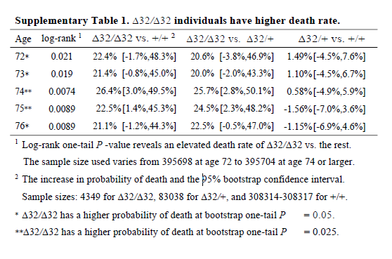
I think it’s wrong to present one-sided P values (in general, but definitely here). The hypothesis should not have been that the CCR5 deletion would increase mortality; it should have been ambivalent, like almost all hypotheses in this field. The whole point of the CRISPR was that the babies would be more protected from HIV, so unless the authors had an unimaginably strong prior that CCR5 was deleterious, why would they use one-sided P values? Cynically, but without a strong reason to think otherwise, I can only imagine because one-sided P values are half as large as two-sided P values.
The best analysis, I think, would have been a Cox regression. Happily, the authors did this after the main analysis. But the full analysis that included all PCs (but not centre) was relegated to the supplement, for reasons that are baffling since it gives the same result as using just 5 PCs.
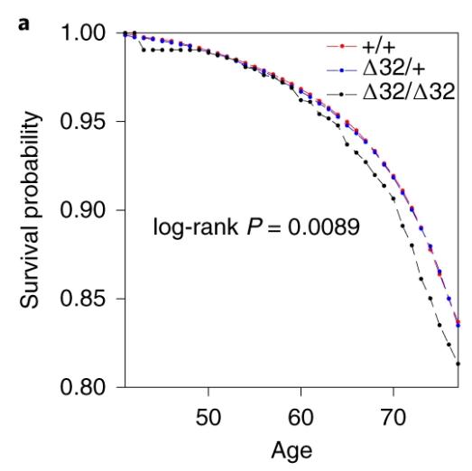
Also, the survival curve should have CIs. We know nothing about whether those curves are separate without CIs. I reproduced survival curves with a different SNP (see below) – the CIs are large.
I’m not going to talk about the Hardy-Weinburg Equilibrium (HWE, inbreeding) analysis– it’s still not an area I’m familiar with, and I don’t really think it adds much to the analysis. There are loads of reasons why a SNP might be out of HWE – dying early is certainly one of them, but it feels like this would just be a confirmation of something you’d know from a Cox regression.
Replication Analyses
I have access to UK Biobank data for my own work, so I didn’t think it would be too complex to replicate the analyses to see if I came up with the same answer. I don’t have access to rs62625034, the SNP the paper says is a great proxy of the delta-32 deletion, for reasons that I’ll go into later. However, I did have access to rs113010081, which the paper said gave the same results. I also used rs113341849, which is another SNP in the same region that has extremely high correlation with the deletion (both SNPs have R2 values above 0.93 with rs333, which is the rs ID for the delta-32 deletion). Ideally, all three SNPs would give the same answer.
First, I created the analysis dataset:
- Grabbed age, sex, centre, principal components, date of registration and date of death from the UK Biobank phenotypic data
- Grabbed the genetic dosages of rs113010081 and rs113341849 from the UK Biobank genetic data
- Grabbed the list of related participants in UK Biobank, and our usual list of exclusions (including withdrawals)
- Merged everything together, estimating the follow-up time for everyone, and creating a dummy variable of death (1 for those that died, 0 for everyone else) and another one for relateds (0 for completely related people, 1 for those I would typically remove because of relatedness)
- Dropped the standard exclusions, because there aren’t many and they really shouldn’t be here
- I created dummy variables for the SNPs, with 1 for participants with two effect alleles (corresponding to a proxy for having two copies of the delta-32 deletion), and 0 for everyone else
- I also looked at what happened if I left the dosage as 0, 1 or 2, but since there was no evidence that 1 was any different from 0 in terms of mortality, I only reported the 2 versus 0/1 results
I conducted 12 analyses in total (6 for each SNP), but they were all pretty similar:
- Original analysis: time = study time (so x-axis went from 0 to 10 years, survival from baseline to end of follow-up), with related people included, and using age, sex, principal components and centre as covariables
- Original analysis, without relateds: as above, but excluding related people
- Analysis 2: time = age of participant (so x-axis went from 40 to 80 years, survival up to each year of life, which matches the paper), with related people included, and using sex, principal components and centre as covariables
- Analysis 2, without relateds: as above, but excluding related people
- Analysis 3: as analysis 2, but without covariables
- Analysis 3, without relateds: as above, but excluding related people
With this suite of analyses, I was hoping to find out whether:
- either SNP was associated with mortality
- including covariables changed the results
- the time variable changed the results, and d) whether including relateds changed the results
Results
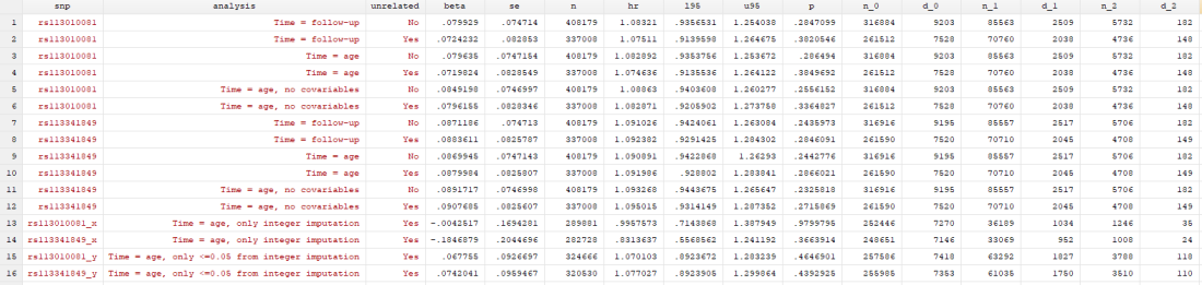
I found… Nothing. There was very little evidence the SNPs were associated with mortality (the hazard ratios, HRs, were barely different from 1, and the confidence intervals were very wide). There was little evidence including relateds or more covariables, or changing the time variable, changed the results.
Here’s just one example of the many survival curves I made, looking at delta-32/delta-32 (1) versus both other genotypes in unrelated people only (not adjusted, as Stata doesn’t want to give me a survival curve with CIs that is also adjusted) – this corresponds to the analysis in row 6.
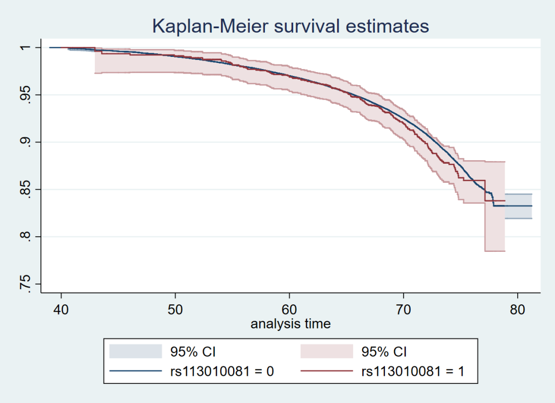
You’ll notice that the CIs overlap. A lot. You can also see that both events and participants are rare in the late 70s (the long horizontal and vertical stretches) – I think that’s because there are relatively few people who were that old at the end of their follow-up. Average follow-up time was 7 years, so to estimate mortality up to 76 years, I imagine you’d want quite a few people to be 69 years or older, so they’d be 76 at the end of follow-up (if they didn’t die). Only 3.8% of UK Biobank participants were 69 years or older.
In my original tweet thread, I only did the analysis in row 2, but I think all the results are fairly conclusive for not showing much.
In a reply to me, Rasmus stated:

This is the claim that turned out to be incorrect:
Never trust data that isn’t shown – apart from anything else, when repeating analyses and changing things each time, it’s easy to forget to redo an extra analysis if the manuscript doesn’t contain the results anywhere.
This also means I couldn’t directly replicate the paper’s analysis, as I don’t have access to rs62625034. Why not? I’m not sure, but the likely explanation is that it didn’t pass the quality control process (either ours or UK Biobank’s, I’m not sure).
SNPs
I’ve concluded that the only possible reason for a difference between my analysis and the paper’s analysis is that the SNPs are different. Much more different than would be expected, given the high amount of correlation between my two SNPs and the deletion, which the paper claims rs62625034 is measuring directly.
One possible reason for this is the imputation of SNP data. As far as I can tell, neither of my SNPs were measured directly, they were imputed. This isn’t uncommon for any particular SNP, as imputation of SNP data is generally very good. As I understand it, genetic code is transmitted in blocks, and the blocks are fairly steady between people of the same population, so if you measure one or two SNPs in a block, you can deduce the remaining SNPs in the same block.
In any case there is a lot of genetic data to start with – each genotyping chip measures hundred of thousands of SNPs. Also, we can measure the likely success rate of the imputation, and SNPs that are poorly imputed (for a given value of “poorly”) are removed before anyone sees them.
The two SNPs I used had good “info scores” (around 0.95 I think – for reference, we dropped all SNPs with an info score of less than 0.3 for SNPs with minor allele frequencies similar), so we can be pretty confident in their imputation. On the other hand, rs62625034 was not imputed in the paper, it was measured directly. That doesn’t mean everyone had a measurement – I understand the missing rate of the SNP was around 3.4% in UK Biobank (this is from direct communication with the authors, not from the paper).
But. And this is a weird but that I don’t have the expertise to explain, the imputation of the SNPs I used looks… well… weird. When you impute SNP data, you impute values between 0 and 2. They don’t have to be integer values, so dosages of 0.07 or 1.5 are valid. Ideally, the imputation would only give integer values, so you’d be confident this person had 2 mutant alleles, and this person 1, and that person none. In many cases, that’s mostly what happens.
Non-integer dosages don’t seem like a big problem to me. If I’m using polygenic risk scores, I don’t even bother making them integers, I just leave them as decimals. Across a population, it shouldn’t matter, the variance of my final estimate will just be a bit smaller than it should be. But for this work, I had to make the non-integer dosages integers, so anything less than 0.5 I made 0, anything 0.5 to 1.5 was 1, and anything above 1.5 was 2. I’m pretty sure this is fine.
Unless there’s more non-integer doses in one allele than the other.
rs113010081 has non-integer dosages for almost 14% of white British participants in UK Biobank (excluding relateds). But the non-integer dosages are not distributed evenly across dosages. No. The twos has way more non-integer dosages than the ones, which had way more non-integer dosages than the zeros.
In the below tables, the non-integers are represented by being missing (a full stop) in the rs113010081_x_tri variable, whereas the rs113010081_tri variable is the one I used in the analysis. You can see that of the 4,736 participants I thought had twos, 3,490 (73.69%) of those actually had non-integer dosages somewhere between 1.5 and 2.

What does this mean?
I’ve no idea.
I think it might mean the imputation for this region of the genome might be a bit weird. rs113341849 has the same pattern, so it isn’t just this one SNP.
But I don’t know why it’s happened, or even whether it’s particularly relevant. I admit ignorance – this is something I’ve never looked for, let alone seen, and I don’t know enough to say what’s typical.
I looked at a few hundred other SNPs to see if this is just a function of the minor allele frequency, and so the imputation was naturally just less certain because there was less information. But while there is an association between the minor allele frequency and non-integer dosages across dosages, it doesn’t explain all the variance in the estimate. There were very few SNPs with patterns as pronounced as in rs113010081 and rs113341849, even for SNPs with far smaller minor allele frequencies.
Does this undermine my analysis, and make the paper’s more believable?
I don’t know.
I tried to look at this with a couple more analyses. In the “x” analyses, I only included participants with integer values of dose, and in the “y” analyses, I only included participants with dosages < 0.05 from an integer. You can see in the results table that only using integers removed any effect of either SNP. This could be evidence that the imputation having an effect, or it could be chance. Who knows.
rs62625034
rs62625034 was directly measured, but not imputed, in the paper. Why?
It’s possibly because the SNP isn’t measuring what the probe meant to measure. It clearly has a very different minor allele frequency in UK Biobank (0.1159) than in the GO-ESP population (~0.03). The paper states this means it’s likely measuring the delta-32 deletion, since the frequencies are similar and rs62625034 sits in the deletion region. This mismatch may have made it fail quality control.
But this raises a couple of issues. First is whether the missingness in rs62625034 is a problem – is the data missing completely at random or not missing at random. If the former, great. If the latter, not great.
The second issue is that rs62625034 should be measuring a SNP, not a deletion. In people without the deletion, the probe could well be picking up people with the SNP. The rs62625034 measurement in UK Biobank should be a mixture between the deletion and a SNP. The R2 between rs62625034 and the deletion is not 1 (although it is higher than for my SNPs – again, this was mentioned in an email to me from the authors, not in the paper), which could happen if the SNP is picking up more than the deletion.
The third issue, one I’ve realised only just now, is that previous research has shown that rs62625034 is not associated with lifespan in UK Biobank (and other datasets). This means that maybe it doesn’t matter that rs62625034 is likely picking up more than just the deletion.
Peter Joshi, author of the article, helpfully posted these tweets:


If I read this right, Peter used UK Biobank (and other data) to produce the above plot showing lots of SNPs and their association with mortality (the higher the SNP, the more it affects mortality).
Not only does rs62625034 not show any association with mortality, but how did Peter find a minor allele frequency of 0.035 for rs62625034 and the paper find 0.1159? This is crazy. A minor allele frequency of 0.035 is about the same as the GO-ESP population, so it seems perfectly fine, whereas 0.1159 does not.
I didn’t clock this when I first saw it (sorry Peter), but using the same datasets and getting different minor allele frequencies is weird. Properly weird. Like counting the number of men and women in a dataset and getting wildly different answers. Maybe I’m misunderstanding, it wouldn’t be the first time – maybe the minor allele frequencies are different because of something else. But they both used UK Biobank, so I have no idea how.
I have no answer for this. I also feel like I’ve buried the lead in this post now. But let’s pretend it was all building up to this.
Conclusion
This paper has been enormously successful, at least in terms of publicity. I also like to think that my “post-publication peer review” and Rasmus’s reply represents a nice collaborative exchange that wouldn’t have been possible without Twitter. I suppose I could have sent an email, but that doesn’t feel as useful somehow.
However, there are many flaws with the paper that should have been addressed in peer review. I’d love to ask the reviewers why they didn’t insist on the following:
- The sample should be well defined, i.e. “white British ancestry” not “British ancestry”
- Standard exclusions should be made for sex mismatches, sex chromosome aneuploidy, participants with outliers in heterozygosity and missing rates, and withdrawals from the study (this is important to mention in all papers, right?)
- Relatedness should either be accounted for in the analysis (e.g. Bolt-LMM) or related participants should be removed
- Population stratification should be both addressed in the analysis (maximum principal components and centre) and the limitations
- All effect estimates should have confidence intervals (I mean, come on)
- All survival curves should have confidence intervals (ditto)
- If it’s a survival analysis, surely Cox regression is better than ratios of survival rates? Also, somewhere it would be useful to note how many people died, and separately for each dosage
- One-tailed P values need a huge prior belief to be used in preference to two-tailed P values
- Over-reliance on P values in interpretation of results is also to be avoided
- Choice of SNP, if you’re only using one SNP, is super important. If your SNP has a very different minor allele frequency from a published paper using a very similar dataset, maybe reference it and state why that might be. Also note if there is any missing data, and why that might be ok
- When there is an online supplement to a published paper, I see no legitimate reason why “data not shown” should ever appear
- Putting code online is wonderful. Indeed, the paper has a good amount of transparency, with code put on github, and lab notes also put online. I really like this.
So, do I believe “CCR5-∆32 is deleterious in the homozygous state in humans”?
No, I don’t believe there is enough evidence to say that the delta-32 deletion in CCR-5 affects mortality in people of white British ancestry, let alone people of other ancestries.
I know that this post has likely come out far too late to dam the flood of news articles that have already come out. But I kind of hope that what I’ve done will be useful to someone.

 Dr Lindsey Hines, Sir Henry Wellcome Postdoctoral Fellow in The Centre for Academic Mental Health & the Integrative Epidemiology Unit, University of Bristol